Fonts for dyslexia: OpenDyslexic, the best typefaces and what matters
Sooner or later, anyone with dyslexia hears about OpenDyslexic and the other “dyslexia fonts”, with heavier letters at the bottom. The promise is simple: change the font and read better. But is it true?
Here’s what the research says, which typefaces to choose and, above all, the settings that matter more than the font: size, spacing, background. Easier reading is one of the assistive tools: the full picture is in the guide to assistive tools and exemptions.
Fonts designed for dyslexia
| Font | How it’s designed | Licence |
|---|---|---|
| OpenDyslexic | Letters weighted at the bottom, to “anchor” them to the line and make them less alike | Free (SIL Open Font License) |
| Dyslexie | A similar idea: different shapes for letters that get mixed up (b/d, p/q) | Paid for many uses |
| Atkinson Hyperlegible | Made for people with low vision (Braille Institute): each letter is drawn not to resemble the others | Free |
| Lexend | Designed for faster reading, with wide letters and plenty of space | Free |
What the research says
On “special” fonts the research is cooler than the promises:
- a study with Spanish readers with dyslexia, using eye-tracking (Rello and Baeza-Yates, 2013), found no shorter reading times with OpenDyslexic;
- a US study with students with dyslexia (Wery and Diliberto, 2017) found no improvement in reading speed or accuracy with OpenDyslexic;
- a Dutch study with children with and without dyslexia (Kuster and colleagues, 2018) found that the Dyslexie font does not improve reading, and the children preferred Arial.
At the same time, some students say they feel better with OpenDyslexic, mostly because of how the page looks. And comfort matters: if a font makes you want to read, that’s already a plus.
In short: a special font is not a cure. If you like it, use it; if you don’t, you’re not missing anything.
What really matters: spacing
A widely cited Italian and French study (Zorzi and colleagues, 2012), with 94 children with dyslexia, found a much clearer effect: with more space between letters and words, the children read about 20% faster and made half as many errors.
The explanation is visual crowding: in dyslexia, neighbouring letters interfere with each other more than usual. Widening the spacing reduces the interference.
Recommended settings
Dyslexia style guides, such as the British Dyslexia Association’s, agree on a few simple points:
| Setting | Advice |
|---|---|
| Typeface | Sans serif, simple: Arial, Verdana, Open Sans, or one of the fonts in the table above |
| Size | 12-14 pt or more; headings at least 20% larger |
| Line spacing | 1.5 |
| Letter and word spacing | A little wider than normal |
| Background | Plain colour, not glaring white: cream or a soft tint |
| Italics, underline, ALL CAPS | Avoid them for whole paragraphs: use bold for emphasis |
| Alignment | Left-aligned, not justified: uneven gaps between words are confusing |
How to find your combination
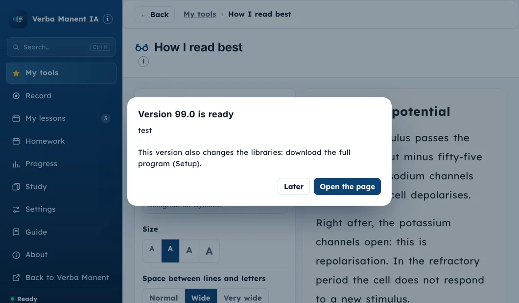
Every reader is different. A practical way to choose:
- Take a real page of what you’re studying, not a sample text.
- Change one thing at a time: size first, then spacing, then background, the font last.
- Read aloud for a minute with each combination and note how many lines you read and how tired you got.
- Keep the best combination everywhere: notes, digital books, flashcards. Switching every time is tiring.
- Add listening: for long texts, text-to-speech removes much of the effort.
- A different app for every tool
- Maps built by hand after every lecture
- Text-to-speech reads, but it isn't your lecturer's voice
- Every tool in one place
- A test map ready from your lectures
- Karaoke with the lecturer's real voice
The most common mistakes
- Thinking that changing the font is enough: spacing, size and background matter more.
- Using italics or ALL CAPS for emphasis.
- Justified text, with uneven gaps between words.
- A bright white background with small, thin letters.
- Changing settings every day instead of finding your combination and keeping it.
Sources
- Zorzi, M., Barbiero, C., Facoetti, A., et al. (2012). Extra-large letter spacing improves reading in dyslexia. Proceedings of the National Academy of Sciences, 109(28), 11455-11459. doi:10.1073/pnas.1205566109
- Rello, L., Baeza-Yates, R. (2013). Good fonts for dyslexia. Proceedings of the 15th International ACM SIGACCESS Conference on Computers and Accessibility (ASSETS ‘13). doi:10.1145/2513383.2513447
- Wery, J. J., Diliberto, J. A. (2017). The effect of a specialized dyslexia font, OpenDyslexic, on reading rate and accuracy. Annals of Dyslexia, 67(2), 114-127. doi:10.1007/s11881-016-0127-1
- Kuster, S. M., van Weerdenburg, M., Gompel, M., Bosman, A. M. T. (2018). Dyslexie font does not benefit reading in children with or without dyslexia. Annals of Dyslexia, 68(1), 25-42. doi:10.1007/s11881-017-0154-6
- British Dyslexia Association, Dyslexia Style Guide. bdadyslexia.org.uk
Verba Manent puts every assistive tool in one place
The tools in order: in class, after the lecture, for the test, for your teacher.
The lecturer's real voice with the words lighting up.
An A4 sheet with key words and formulas, with name and class.
The sheet for your school plan or university.